 Infographics have been around for centuries, from ancient cave paintings to modern subway maps to (probably the most recognizable infograph of all time) the Periodic Table published back in 1869.
Recently, infographics and info-art have gotten a second wind. Data visualization has have become a popular trend for folks who want to quickly and easily present complex information. It’s no wonder since we live in an age where data is being produced at exponential rates. In fact, Google executives estimate that every two days, we create as much data as we did between the “dawn of time through 2003.” Every two days! Much of this is generated from social media such as Facebook, Twitter, Four Square and the  like.
like.
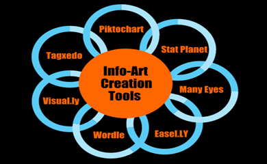
The increasing number of easy-to-use tools available has also made it easier for those without a degree in design to generate creative infographics; and to share them with the masses via social media.
Here’s a few tools that you might try:
| |
|
|
Find even more tools on our Census & Data Library Guide.

